
The 3-Click Problem: When Your Website Makes People Work Too Hard
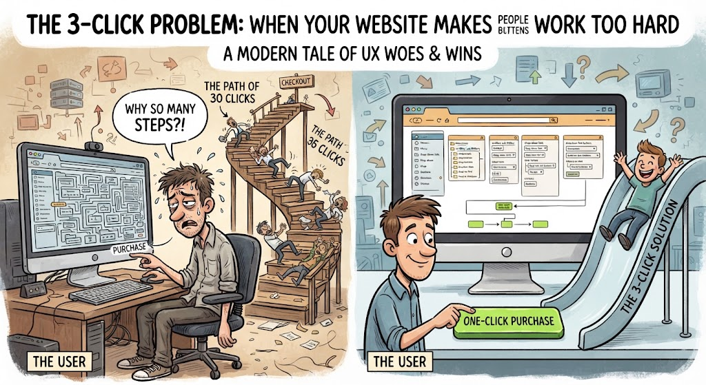
I’ve noticed something about websites that makes me leave pretty quickly.
If I have to hunt for something that should be easy to find, I’m probably going somewhere else.
This is where website navigation matters.
There’s a common idea that users should be able to find anything on a website within three clicks. I don’t think the exact number is the real point.
The real question is: how much effort are you making the user spend?
🖱️ Fewer Clicks Isn’t Always Better
Three clicks aren’t automatically good.
Sometimes a user might happily click several times if every step makes sense.
The problem is when those clicks feel like a maze.
For example:
Homepage → Menu → Category → Subcategory → Random page → Where am I?
At that point, the website has turned finding information into a treasure hunt.
And most users didn’t come for the treasure hunt.
🧭 Good UX Gives People Direction
A good website should make it reasonably obvious:
- Where am I?
- Where can I go?
- What can I click?
- What happens when I click it?
- How do I get back?
Navigation shouldn’t require detective work.
Clear menus, descriptive links, logical categories and visible calls to action can make a huge difference.
📱 Think Beyond the Homepage
UX isn’t just about making a beautiful homepage.
A user might land on an individual blog post from Google, social media, or an AI search result.
So that page needs to make sense even if it’s the first page they see.
Can they understand what your website is about?
Can they find related content?
Can they navigate somewhere useful next?
If not, you’ve created a dead end.
My Takeaway
I don’t think websites need to obsess over hitting an exact number of clicks.
They need to reduce unnecessary effort.
If a user knows where they are, understands their options and can easily move toward what they want, the experience becomes much smoother.
Good UX doesn’t make people think about the navigation. It helps them get where they’re going.
And honestly, that’s the whole point.
My UX input: Don’t ask, “How many clicks does this take?”
Ask:
“How hard am I making this for someone who has never seen my website before?”

Alina | Website Strategy & UX
Leave a Reply