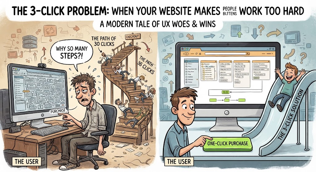
You have user journeys, navigation systems, information architecture, conversion paths, heatmaps and approximately 47 different acronyms.
Meanwhile, cats have been practicing user experience for centuries.
We simply walk away when something is confusing.
I am Simmba, and today, I will be explaining UX the feline way.
🐾 Rule One: Make It Easy to Find What We Want
When I want food, I should not need to navigate through three rooms , click a mysterious button and complete a personality assessment.
I walk to my food bowl.
The food bowl is there.
Excellent UX.
Your website should work the same way.
Visitors shouldn’t have to hunt for your important information. Your navigation should make sense, your categories should be clear and the things people are most likely to look for should be easy to find.
If a cat can find its food bowl faster than a visitor can find your contact page, we have a problem.
🐾 Rule Two: Don’t Make Me Think Too Hard
Cats are intelligent.
Obviously.
But we also have standards.
If your website makes someone stop and wonder:
“Where am I supposed to click?”
You’ve already lost some of their attention.
Good UX reduces unnecessary thinking.
Clear headings.
Obvious buttons.
Logical menus.
Readable content.
Simple pathways.
Human’s shouldn’t need a detective badge to navigate your website.
🐾 Rule Three: Give Me Somewhere to Go
Imagine walking into a house and discovering that every door looks exactly the same.
You wouldn’t know where anything leads.
That’s what a confusing website can feel like.
A good website gives visitors directions.
Maybe they want to:
Learn something.
Read another article.
Find a product.
Contact you.
Explore a category.
Start with your beginner content.
Give them a clear next step up.
Cats understand this instinctively.
We always know where we are going.
Whether that destination is the food bowl, the sunny window or the exact keyboard you were planning to use.
🐾 Rule Four: Don’t Put Everything in One Box
Humans love putting everything into categories.
Cats also appreciate categories.
Food goes here.
Toys go there.
Important cardboard box goes wherever I decide.
Your website needs the same kind of organisation.
If every article sits under the same kind of “Blog” category, visitors have to do the sorting themselves.
Clear categories can help people understand what your website is about and where they should go next.
Good information architecture isn’t about creating as many categories as possible.
It’s about creating useful relationships between pieces of information.
🐾 Rule Five: Respect My Attention
Cats are easily distracted.
So are humans.
You have approximately three seconds to convince someone that your website is worth exploring before another notification, tab, or mysterious cat video steals their attention.
Don’t bury the important thing.
Make your headline clear.
Make your opening useful.
Give people a reason to continue.
And please don’t make them fight through six pop-ups before they can read the article.
Even I have limits.
🐾 Rule Six: Test Everything
This is where cats become excellent UX researchers.
Put an empty cardboard somewhere new.
We investigate.
Move the box.
We investigate again.
Put the box back.
We investigate again.
This is basically usability testing.
The difference is that cats provide extremely honest feedback.
If we don’t like something, we leave.
Humans should test websites in the same way.
Ask someone unfamiliar with your website to navigate it.
Can they find what they’re looking for?
Do they understand your categories?
Do they understand where to click?
Can they tell what your website is about?
If they struggle, don’t blame the user.
Fix the experience.
🐈⬛ The Simmba UX Test
Before launching a page, ask:
Can I find what I need? Do I understand where I am?
Do I know where to go next?
Is anything unnecessarily complicated?
If the answer is yes, congratulations.
Your website may have passed the Simmba Test™.
If not…
I recommend sitting on your keyboard until the problem is resolved.
My Human Input
This article uses Simmba’s perspective to make UX principles easier and more memorable, but the underlying ideas are grounded in a simple belief:
Good UX should make things easier for people, not make them work harder to understand your website.
Cats just happen to be exceptionally opiniated UX consultants.
And I have never once received an invoice from Simmba.