
Most advice about a site that looks good but doesn’t convert argues about taste. Taste can’t be measured, and visitors don’t judge your site by it anyway. They arrive wanting to do something: find a price, read a post, join a list, book a call. If they can’t do it quickly, they leave, and the polish doesn’t change that.
This is a working guide to how to find conversion friction on your website. The “why” is covered in Why Visual Appeal Isn’t Enough for Conversion. Here the focus is on where the friction sits and what to change first.
Design gets praised, tasks get completed: what you’re actually diagnosing
Friction is anything that makes the action you want slower, harder or less certain than the visitor expected. It is rarely one dramatic flaw. It is usually small things stacked up: a headline that sounds nice but explains nothing, a menu label that makes people guess, a button that blends into the background.
Beautiful pages are especially prone to this, because the choices that make a page look refined are often the ones that reduce clarity. Generous white space pushes the button down the screen. Minimal navigation hides the pages people were looking for. Subtle text colour looks elegant and is hard to read outdoors on a phone.
So the aim is to stop asking “does this look good?” and start asking “can a stranger complete the task?” The rest of this guide is a way to answer that with observation and a few free tools.
Start with one job: define the single action a visitor should take
Before you inspect anything, write one sentence: “On this page, a visitor should [do one thing].” Subscribe to the newsletter. Request a review. Click through to a product. Pick one per page.
A page with four equal-weight actions has no priority, and visitors will not choose a priority for you. Many homepages try to do everything: sell a service, grow a list, showcase a blog and link to socials. That is a fair description of a site, but it is a poor brief for a page.
Then write down the smallest version of success you can observe. For a newsletter page it might be “email field submitted.” For a service page it might be “contact form started.” You will need this later, because you can only find friction relative to a goal. Without one, every flaw looks equally important.
Do the walkthrough on your phone, as a stranger would
Use your actual phone, not a resized desktop window. Many sites are built and approved on a laptop, which means the owner has barely seen their own mobile experience. If you can, borrow a different phone and use mobile data instead of your home wifi, since your own device caches your site and your home connection flatters it.
Open the page from a link, the way a visitor would, and complete the single job you defined. Do not go looking for problems. Just try to finish the task and notice every moment you hesitate, scroll back, mis-tap or squint.
Keep a running list with these questions in mind:

- Within the first screen, can you say what this page offers and who it is for? Cover the logo and see if the headline alone tells you.
- How many seconds pass before you see the action? Count them, honestly.
- Do any pop-ups, banners or chat widgets cover the content? Check whether you can close each one with a thumb.
- When you tap a field, does the keyboard cover the button or the next field?
- Can you reach the next page you’d expect (pricing, about, contact) without hunting?
Then ask someone who has never seen the site to do the same task while you stay quiet. Five minutes of watching a stranger hesitate will show you more than an hour of your own review, because you can no longer see your site with fresh eyes. Don’t explain anything while they use it. The moments where you want to jump in are the findings.
Five places beautiful pages usually create friction
These are common patterns, not a guarantee that your site has them. Check each against your walkthrough notes.
1. The headline sets a mood instead of making an offer
Phrases like “Elevate your digital presence” or “Where strategy meets story” sound polished and tell a stranger nothing. A visitor should be able to learn what you do, for whom, within a few seconds. A clear, slightly plain headline usually beats a clever one on the page that has to convert.
2. Navigation that is stylish but unclear
Creative menu labels, icon-only buttons and menus hidden behind a symbol make visitors work. Labels such as “Journal” or “Studio” can mean different things to different people, while “Blog” or “Services” mean one thing. Check whether the page that supports your single job is reachable from the menu in one tap.
3. The action is present but weak
Look at your main button on the phone. Is it visible without scrolling far? Does its text say what happens next (“Get the checklist” rather than “Submit”)? Is it contrasted enough against the background to find at a glance? Outlined “ghost” buttons are common on polished sites and are easy to overlook.
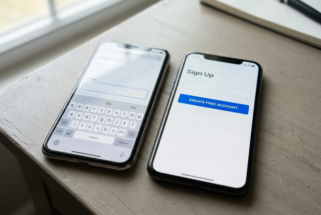
Forms deserve their own look. Every field you ask for is a decision the visitor has to make. If you only need an email address to send a newsletter, a name field and a “how did you hear about us” dropdown are cost without return.
4. Heavy visuals that slow the page or shift the layout
Large images, background video and animation effects can make a page feel slow on a phone connection. Run the page through Google’s free PageSpeed Insights and read the mobile results, not the desktop ones. Also watch for content that jumps as the page loads. If the button moves just as someone taps it, they will tap the wrong thing or give up.
5. Nothing to answer the “can I trust this?” question
A clean page with no visible author, no explanation of what happens after signing up and no sign of who stands behind the offer leaves a visitor guessing. That doubt is invisible in analytics and expensive in practice. The trust side has its own walkthrough in Your Rankings Are Fine. Your Visitors Just Don’t Trust You Yet, and it is worth checking after you have fixed the clarity problems above.
What to measure, and what analytics can and can’t tell you
Analytics shows where visitors drop off. It cannot tell you why. Treat the numbers as a way to choose where to look, and treat your own observation as the explanation.
Start with these free tools and reports:
- Google Analytics: set up the one action you defined as a conversion event, then compare mobile and desktop. A large gap between the two is a strong hint that something is wrong on phones specifically.
- Google Search Console: check which queries bring people to the page. If visitors arrive expecting something the headline doesn’t deliver, they will leave quickly, and that mismatch looks like a design problem but is a message problem.
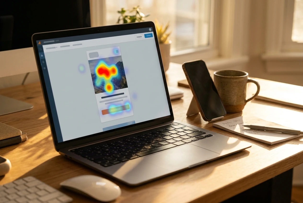
- Microsoft Clarity: a free tool that offers session recordings and heatmaps. Watching a handful of real mobile sessions shows you where people tap on things that aren’t buttons, scroll past your main action or leave a form half finished.
Be careful with what the data can support. A small site may only have a few hundred visits a month, which is not enough to prove that one version beats another. Bounce rate and time on page are also easy to misread: a short visit can mean success if the visitor found what they needed. Use the numbers to narrow your search, and don’t treat a small swing as proof of anything.
Fix one thing, then test it: how to prioritise changes without guessing
After the walkthrough you will probably have a list of fifteen annoyances. Resist fixing all of them at once. If you change the headline, the button, the form and the layout together, you will never know which change helped, or which hurt.
Rank each item on three questions:
- How close is it to the single action? Problems directly in the path of the job outrank cosmetic ones.
- How many people did it affect? Something three testers stumbled over beats something one person mentioned.
- How easy is it to change? A button label takes minutes. A redesigned navigation takes days.
Start with the item that scores well on all three, usually the headline, the button or the form. Make the change, note the date and what you changed, then leave it alone long enough to collect a meaningful number of visits. Compare against your conversion event, and repeat the phone walkthrough to confirm it feels better, not only that the number moved. If the change did nothing, you have still learned that the problem was somewhere else.
No one can promise what a given fix will do to your conversion rate. What you can do is work from evidence: one job, one stranger’s honest attempt, one change at a time.
If you’d rather have a second pair of eyes on your site, request a conversion review and I’ll walk through where your visitors might be getting stuck.