

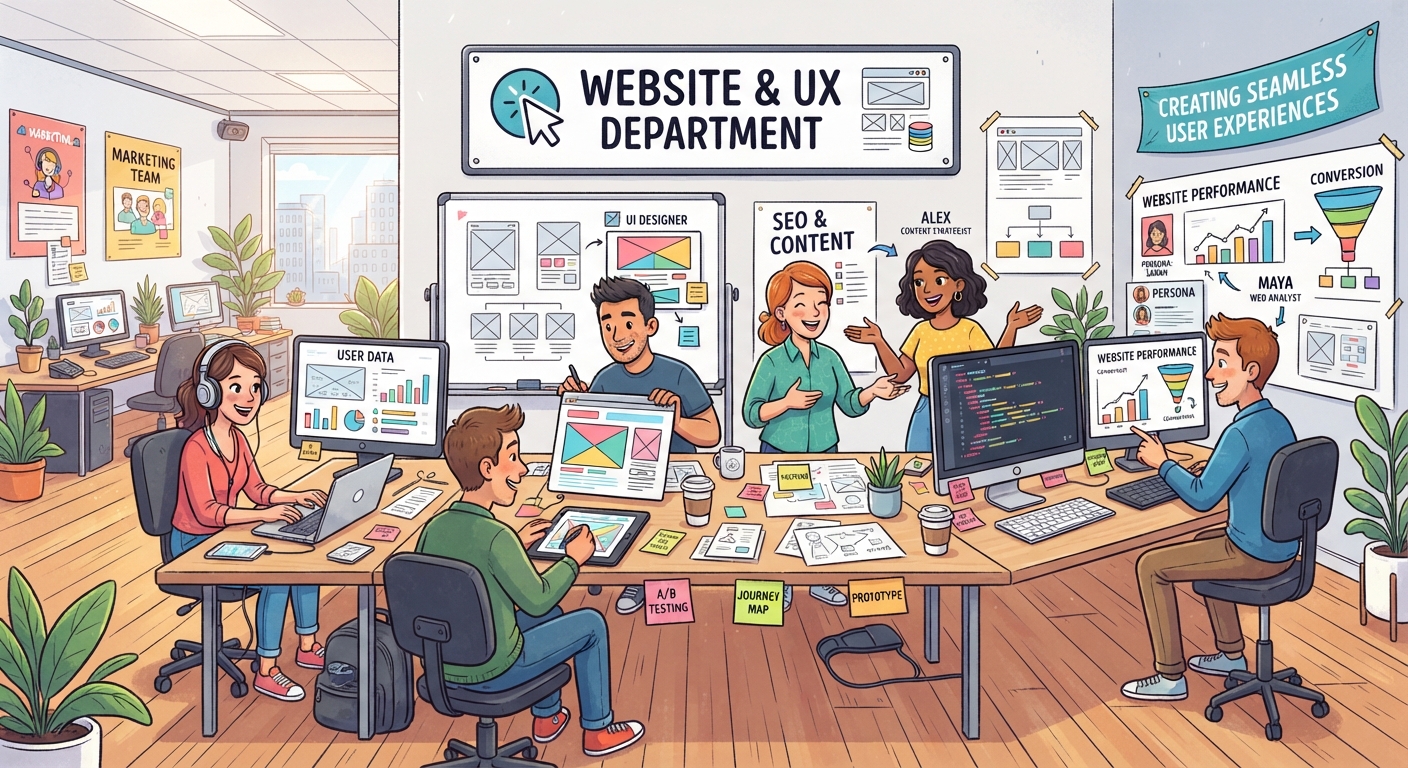

I’ve been spending some time looking at the UX of different marketing websites, and I wanted to see what I could learn from them.
I wasn’t trying to decide which website was “better.” I was more interested in how each one guides visitors, presents information, and makes it easier for people to find what they were looking for.
Here are the things that stood out to me.
Girl Grad Marketing.

One thing I noticed was the community and ecoystem approach.
There are different resources and ways for visitors to engage with the brand.
The challenge with having lots of destinations is making sure visitors don’t feel overwhelmed.
A website should quickly answer three questions:
Who is this for?
What can I find here?
Where do I go next?
Girlpower Marketing
Girlpower Marketing has a strong personality and clear brand identity, while bringing together areas such as PR, content, influencer marketing, events and social media.
The interesting UX challenge is connecting those different services so they feel like parts of the same business rather than separate destinations.
When a company offers multiple services, navigation needs to make those relationships clear.
Bossbabe

Bossbabe immediately makes its audience and intended outcomes clear. It also provides several pathways including membership, an accelerator, AI-related products, newsletters and resources.
With that many options, hierarchy becomes important.
Visitors need to understand which option is relevant to them rather than being presented with too many competing choices.
Its resource section is also a good example of making educational content easier to discover.
Women in Marketing

Something I found interesting about Women In Marketing communities is that belonging can be part of the UX.
These platforms aren’t only about information. They are also helping marketers connect, learn and share experiences.
That means good UX isn’t just about menus and page layouts.
It can also answer:
“Is this place for someone like me?”
The Social Collective
The Social Collective stood out for its problem-to-solution structure.
It addresses problems businesses may recognise, then moves into solutions, services, proof and calls to action.
The process is explained clearly, which helps visitors understand what working with the company looks like.
The main consideration is information density. When there is a lot to communicate, hierarchy becomes extremely important.
Penn & Lytics
Penn & Lytics made me think about the relationship between information and action.
Having lots of data or information isn’t particularly useful if visitors don’t understand what to do with it.
The same applies to websites.
A page can contain plenty of useful information and leave someone thinking:
“Okay… but what do I do now?”
My Biggest Takeaway
After looking across these websites, one thing became very clear to me:
More information doesn’t automatically mean better UX.
A website can have lots of services, resources, and articles and still be difficult to navigate.
Good UX is about helping visitors understand what matters to them and reducing the amount of thinking they have to do to find it.
For me, the biggest lesson was simple:
Good navigation doesn’t just help people move around a website. It helps them find what they actually came for.
Resource List:
Girl Grad Marketing: Girl Grad Marketing
Girlpower Marketing: Girlpower Marketing
Bossbabe: Bossbabe
Women in Marketing: Women in Marketing UK
The Social Collective NZ: The Social Collective
Penn & Lytics: Penn & Lytics